
Teaching Tools of Perception at Mill Road Elementary School
CLICK ON IMAGES
TO FIND BOOKS
OF ORIGIN
All images
© Durga Yael Bernhard
Please do not copy or reproduce.
Last week I visited two classrooms at the Mill Road Elementary School in Red Hook, NY. It was the annual “Author’s Day”, a festive day for booklovers of all ages. Authors and illustrators get a chance to talk to teachers and parents – always a fertile exchange. The seed idea for my award-winning picture book WHILE YOU ARE SLEEPING came out of a conversation I had with a teacher at this very event some seven years ago. I’m glad to see familiar faces.

DETAILS: Many details combine to show how these Tuareg people, nomads of the Sahara, have learned to adapt to their environment.
There’s always a certain tension in the air when I walk into a new classroom. Expectations have been raised in the minds of the many young faces that turn toward me as I open the door. Often two classes are combined in one room so that double the kids may benefit from the teaching author/illustrator’s visit. Today, that visitor is me.
Wading though a sea of curious faces, I make my way among the low desks to the front of the room. The students are eager to be entertained. For my part, I feel both excitement and pressure, as I know I’ll be short on time yet expected to impart to these children something of lasting value. This is a one-time visit of little more than half an hour. What can I give them, in such a short time?

STYLE as a tool of visual communication: choice of style in this illustration of a Lakota tale lets the reader know it is fictitious, and gives a taste of its culture of origin. The owl at the top of this post, styled in the manner of textile patterns indigenous to eastern Siberia, lets the reader know it is not real. All artwork © Durga Yael Bernhard; please do not copy or reproduce.
I begin with basic definitions of what I do. First I introduce myself as an author and illustrator. Then I ask the fifty children before me: What is an author? What is an illustrator? We discuss the various forms of professional writing and art, ranging from the copy on the back of a cereal box to a glittery design on a t-shirt; from the educational posters on the classroom walls to a newspaper diagram about global warming. Somebody has to write the words or design the images we see all around us each day.
Then I ask another question: What is the difference between a painting that hangs in someone’s living room and a picture on a box of tea? How is fine art different from illustration? Many hands are raised and much discussion ensues. It is not a difference of medium, for an oil on canvas may equally be a work of fine art or an illustration. It is not a matter of the content of the picture. Finally we arrive at two essential differences:
1) Fine art may or may not be reproduced, and is not created for this purpose. Illustrations are usually reproduced, and are created for this purpose.

COLOR plays a crucial role in creating both setting and mood in this scene from a Chinese folktale.
2) Fine art may or may not be created with the viewer in mind. It is a work of pure individual expression, and as such, bends to no laws save its own. By contrast, an illustration must always serve the viewer, for its very purpose is to communicate. Illustration exacts a higher sense of accountability than fine art. Yet fine art is more potentially transcendent. The point of the discussion is not to argue which is better, but to understand the difference.

PERSPECTIVE: The choice of both surface and underwater perspective gives the viewer a feel for the journey of this dragonfly nymph preparing to molt.
The next question I ask is, how do illustrators communicate? I invite the children to imagine a special toolbox for illustrators. What would we find inside? What tools do illustrators use to communicate? Not physical tools, like a pencil or paintbrush, but the tools of perception that an illustrator uses to make an image “readable”.
I open a book to find an example. Normally I show art in both my own books and those of other illustrators, but for lack of permission to post the latter on this blog, I will focus on examples in my own books. The images you see here are examples of how the “tools” of visual communication may be put to use.

FACIAL EXPRESSION lets the viewer know what the characters feel.

ARCHITECTURE: another important tool in the illustrator’s toolbox. Architectural detail places a scene both culturally and geographically. This springtime residential neighborhood in Japan was a pleasure to work on. I’ve always loved painting windows!

SKYLINE: if you can crack the look and feel of a skyline, the whole city falls into place! Here is Mt. Royal Park in Montreal.
After the two classroom sessions, I went to the library to join the other authors and illustrators from the region who had gathered for the school’s annual “Author Day”. Amidst cookies, coffee, and books, we chatted and caught up on a year’s worth of news. Soon the bell rang, and many children visited the library after school with their parents to browse the books. I was especially pleased to see the school librarian, Barbara Shoemaker, as we collaborated together years ago when she taught kindergarten. We both remember that class mural fondly! And we both see potential for collaborating again. I look forward to it.

BODY POSITION says it all. There’s no doubt about what’s happening to this reindeer.
As much as I enjoy seeing new faces, I prefer to teach residencies, which allow enough time to get to know children and work with them over a series of sessions. Ultimately, the best way to learn is gradually: step by step, brushstroke by brushstroke.

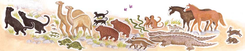
LANDSCAPE: both landscape and perspective help make the journey of these migrating reindeer palpable to readers.
Scroll down for more examples
of visual tools used by illustrators.

SCALE: contrast between large and small, modern and aging buildings helps convey the pair of opposites illustrated here: new and old.

DESIGN: the cover design of this book of opposites helps express the basic concept explored: the life of a child of divorce who goes back and forth from country to city.

SETTING: this common scene from India gives much information to the viewer about how peoples’ lives are different – and how they are the same.

FOOD: Get the food right, and you’ve communicated much about the people and culture shown. I learned a lot about Eritrean cooking in order to illustrate this scene – and even made my own injerra, the delicious flatbread made from teff.

TECHNIQUE: Outlining is a basic tool employed here to mimick the yarn paintings of the Huichol Indians of Mexico, the tellers of this unique creation myth.

CLOTHING: This girl’s costume places her story along the Amur River of Siberia.

Overall it was a great day! Thanks to Maura Sullivan and everyone who volunteered their time to make Author’s Day happen.
For more information about my school visits and arts-in-ed programs, click here.
Happy reading to all!
Durga Yael
![]()